Verrand Water
A water utility whose customers could not tell a bill from a warning. New name architecture, new system, and a third fewer support line calls a year.
| Service | Brand |
|---|---|
| Disciplines | Verbal identity · Correspondence · Environmental · Websites |
| Duration | Nine weeks, then a retainer |
| Shipped | Identity system, correspondence system, website, 140 sign faces |
| Sectors | Water, Utilities, Public-facing |
From the brief: "People should be able to tell, in two seconds and from across a kitchen, whether this letter needs them to do something today."
📉
Twelve months on — 31% fewer support line service calls. Measured against the twelve months before launch, on the same call categories, by Verrand's own contact centre.
What we made
Brand — the nine weeks, and everything they shipped.
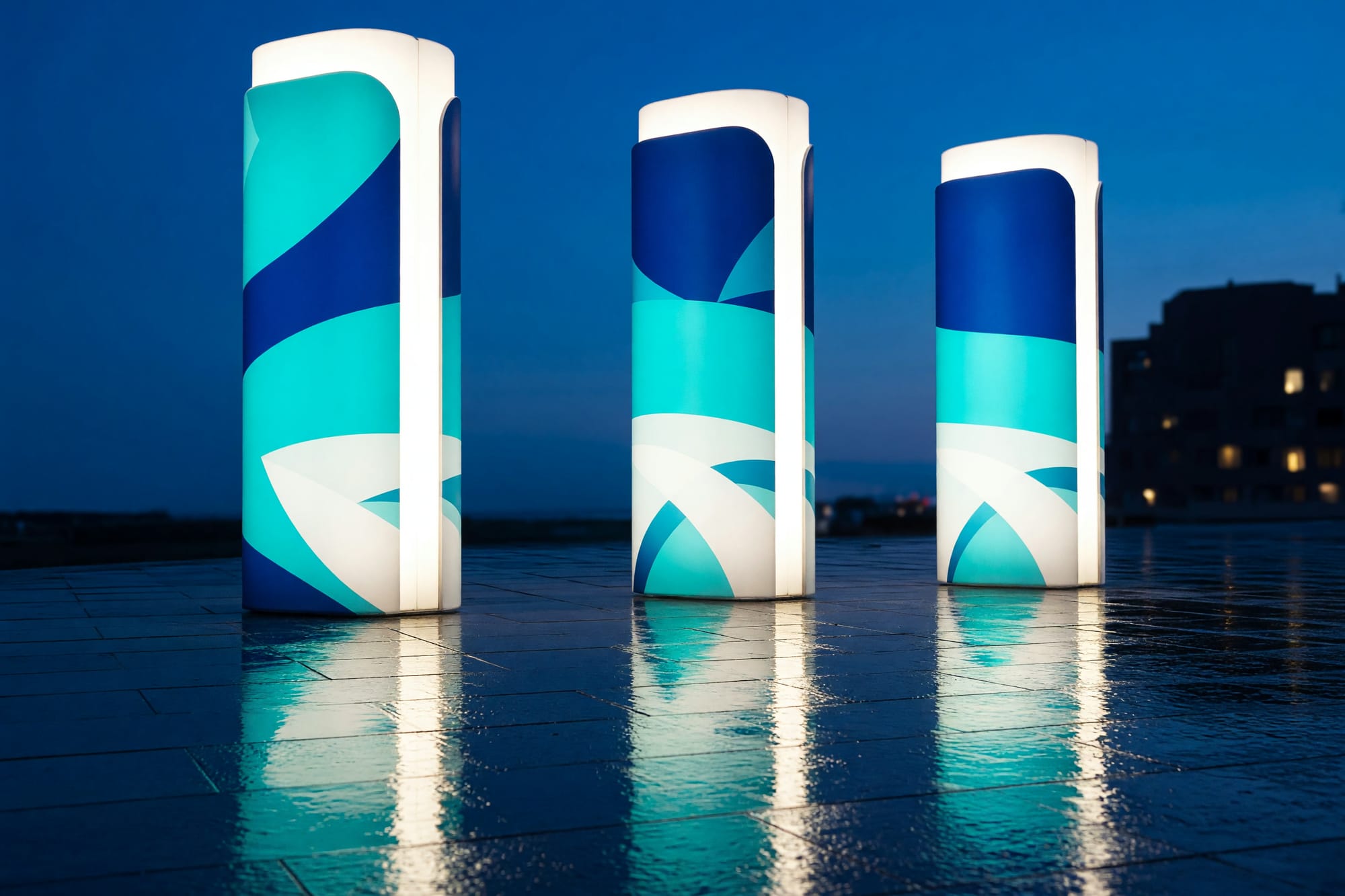
The signage is the part we got wrong first and it is written up properly in the debrief, including the fortnight it cost.
- Positioning, and a name architecture for the parent and its four services
- Verbal identity, written as three tone tiers rather than as adjectives
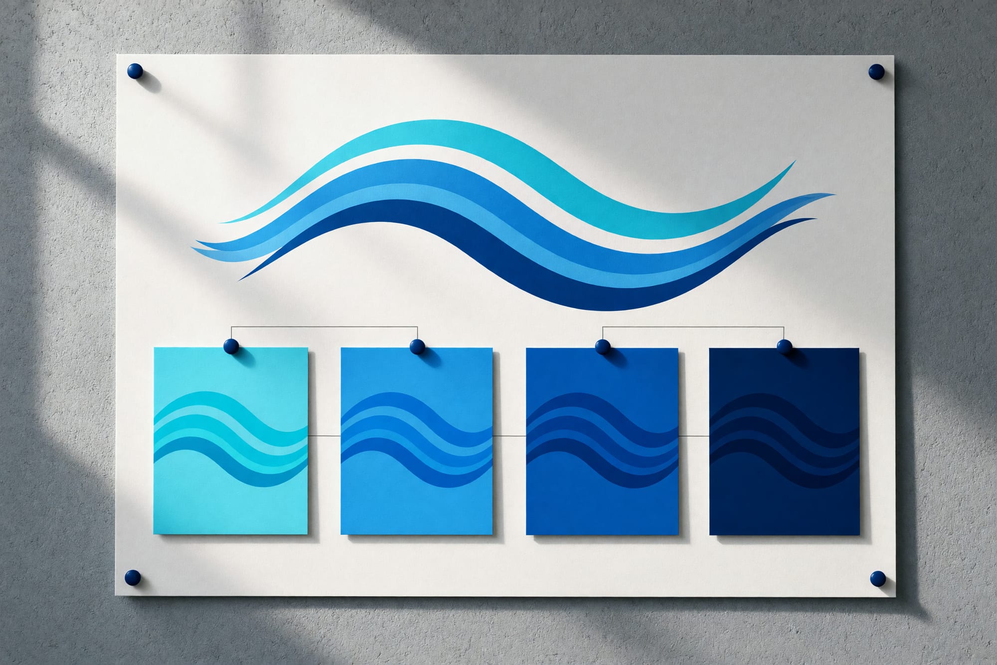
- Mark, type, colour and layout, drawn as a system
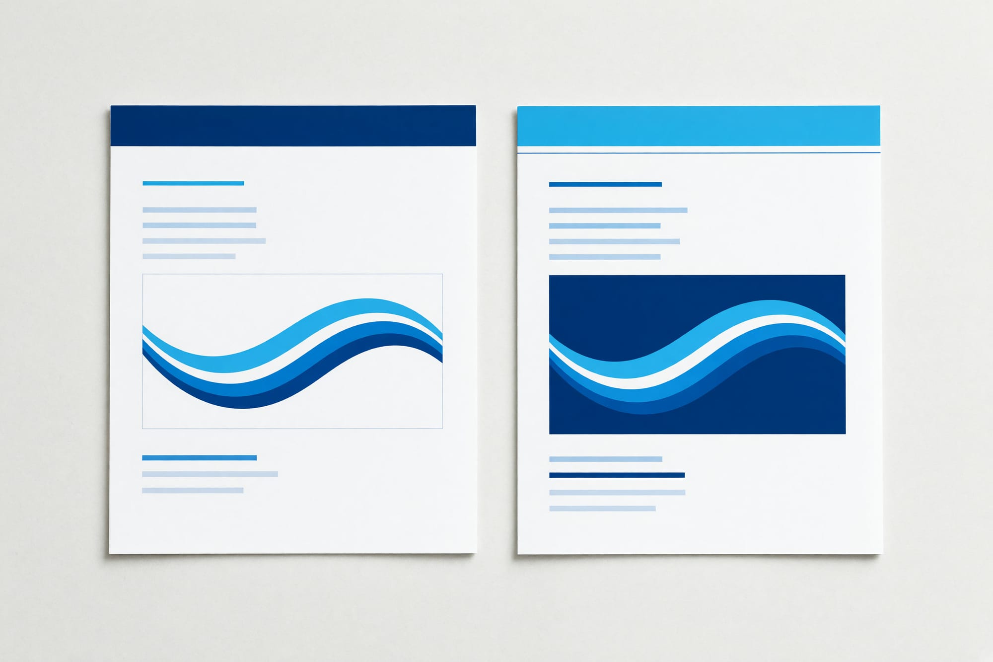
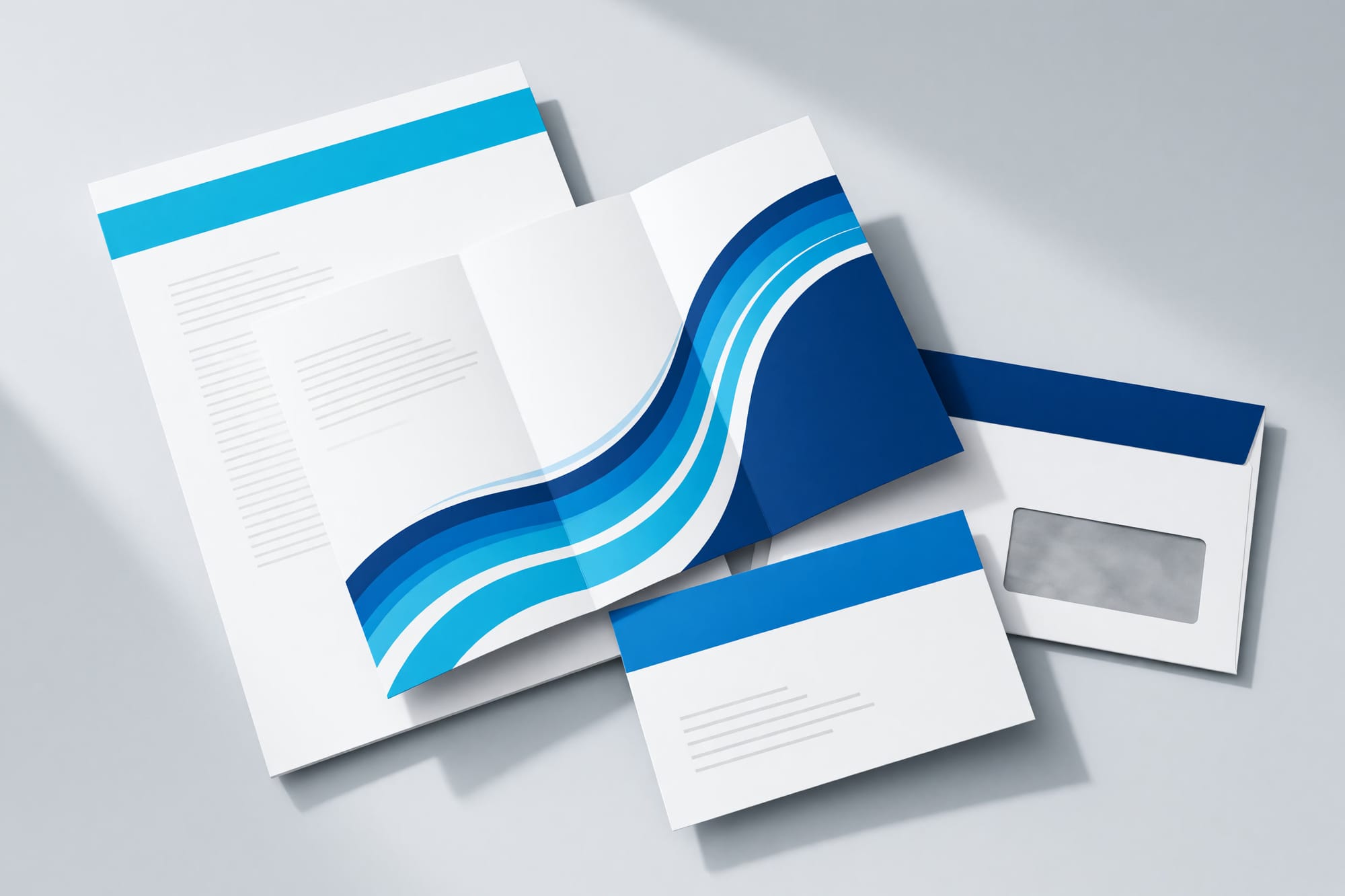
- A three-tier correspondence system — informational, actionable, urgent
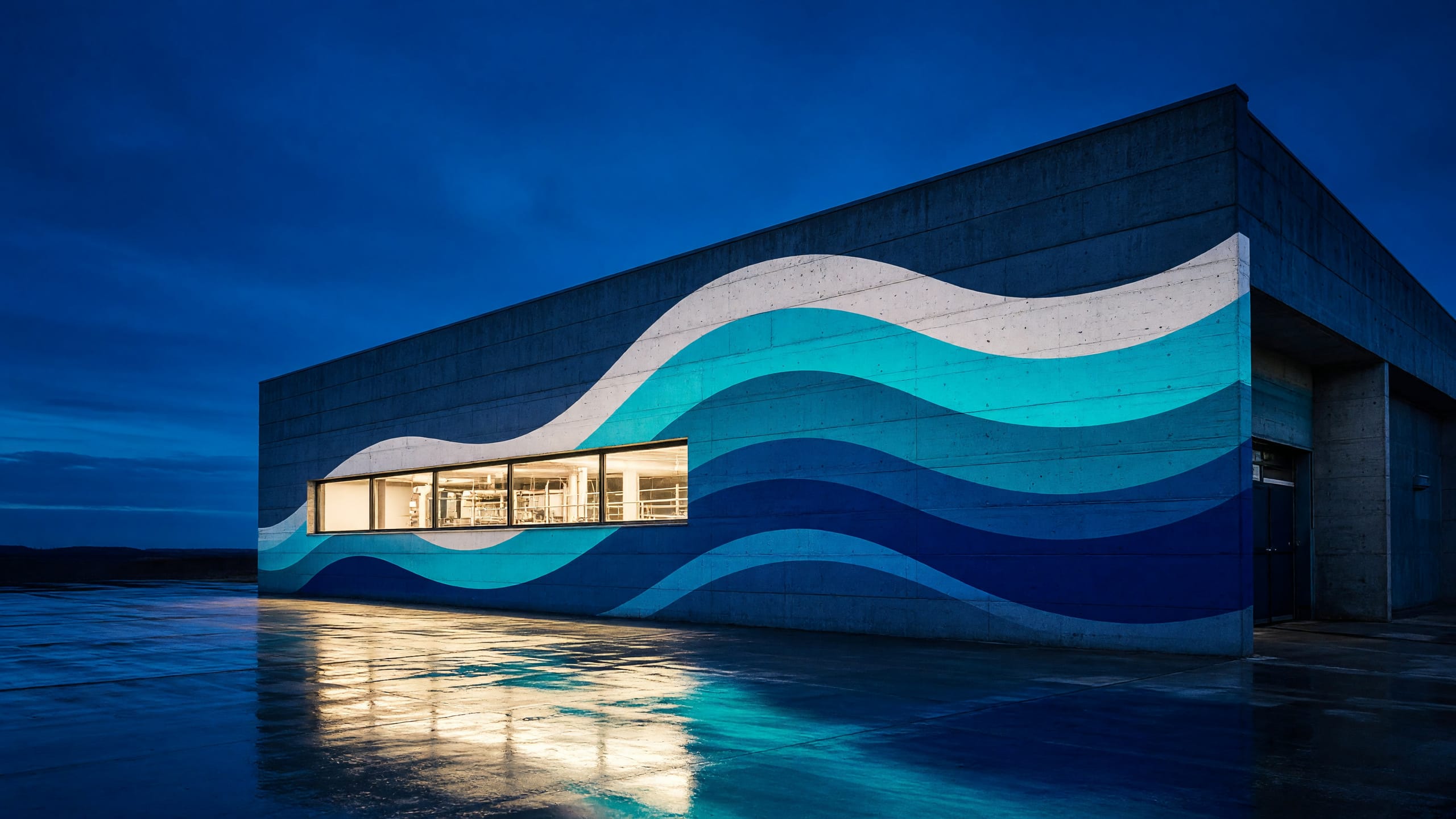
- One hundred and forty sign faces, across pumping stations, reservoirs and street works
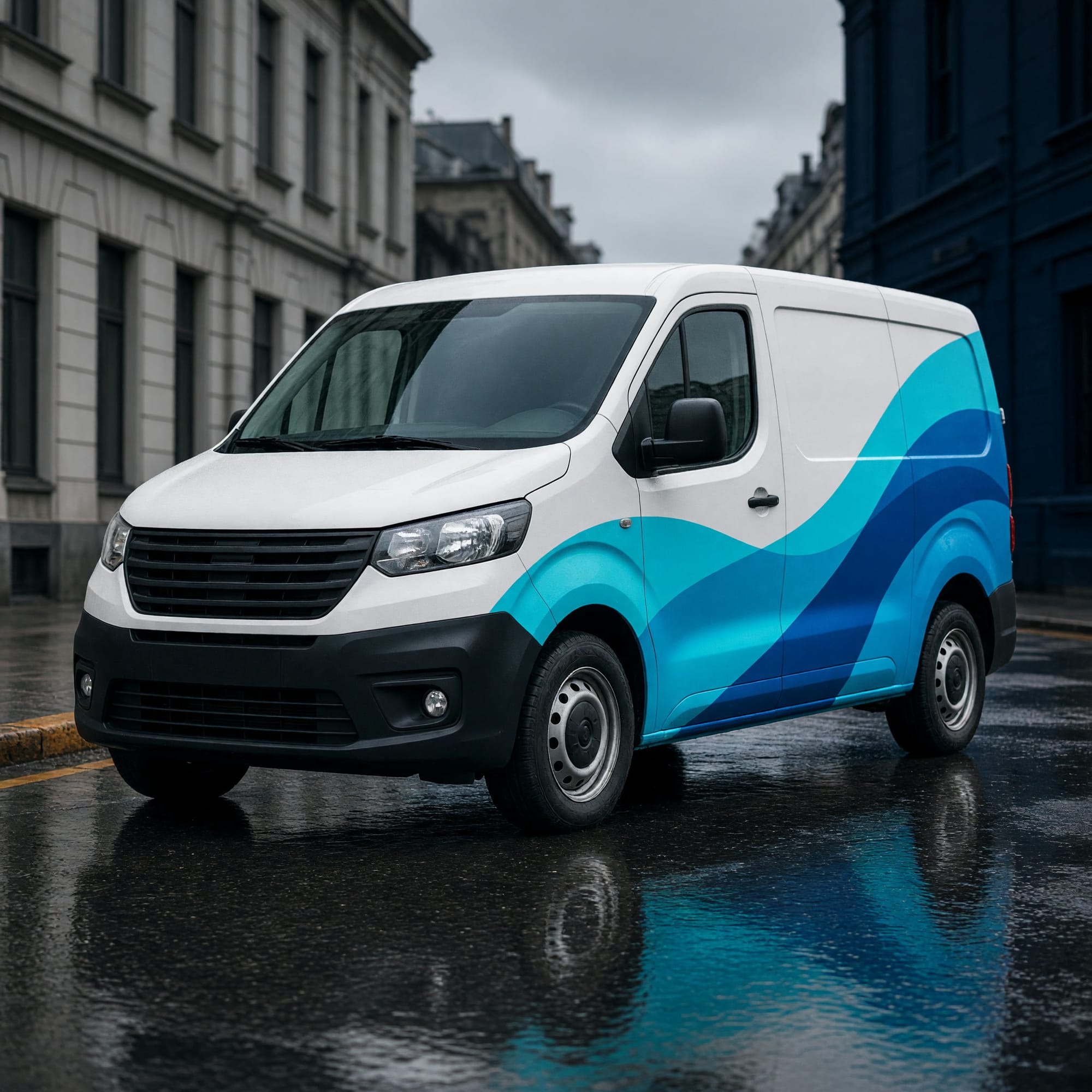
- Fleet livery for ninety vehicles
- Guidance, organised by question