
The debrief: Verrand Water
The format is deliberately dull. What did we say would happen, what happened, and what changes because of it. No scoring, no themes, no lessons-learned slide. If a thing does not change something in the process, it goes in the notes and not in the debrief, because a list of observations that alter nothing is a way of feeling thorough.
What worked
The three-tier correspondence system, and specifically the decision to carry urgency in structure rather than in language. It survived contact with Verrand's legal team, which nothing about a utility's letters normally does, because the tiers gave legal somewhere to be strict without touching the design.
The week-three session also worked, in a way we did not expect. Verrand sent eleven people, which is more than we ask for and usually a warning sign. It turned out to be the only meeting in eighteen months where the contact centre and the communications team had been in one room, and about half the useful information in the project came out of an argument between them that had nothing to do with us.
That is the short half. It is the less interesting one and this piece knows it.
We got the letters right in week five and the signs wrong until week eight, and the reason is that we tested one of them and assumed the other.
What we would do differently
The signage failure is the one worth writing down. We tested the correspondence hierarchy properly — printed, at size, in a kitchen, from two metres — because that was the brief's own scenario. We did not do the equivalent for signage. We reviewed it on screen, agreed it was consistent with the letters, and moved on.
It was consistent. It was also unreadable in the one condition that matters, because a street-works panel spends most of its life half-covered by a barrier, and we had put the accent band at the top.
Verrand's own site team noticed, in week seven, from a photograph. Not us.
| What happened | Why | What changed in The Nine |
|---|---|---|
| Signage hierarchy failed in situ and was re-drawn in week eight | We tested correspondence at real size and in real conditions, then assumed signage would inherit it | Every deliverable is now tested in its own worst condition, and "inherits from" is not a test |
| The week-three session ran forty minutes over and we let it | Eleven attendees, and an argument that was producing genuinely useful material | Nothing. We would let it run again — but the schedule now allows for it rather than pretending it will not happen |
| We measured at launch, not at twelve months | Nobody asked us to, and the number we had at launch was flattering | We now go back at twelve months on every project, and the case-study figures come from that visit rather than from the week after launch |
The third row is the one that changed most about how the studio works, and it started as an uncomfortable observation rather than a failure. The launch-week numbers were good. They were also meaningless — a spike in traffic and a drop in calls that could have been the weather. The thirty-one per cent in the case study is from twelve months later, and it is a smaller, duller and considerably more defensible number than the one we could have published at the time.
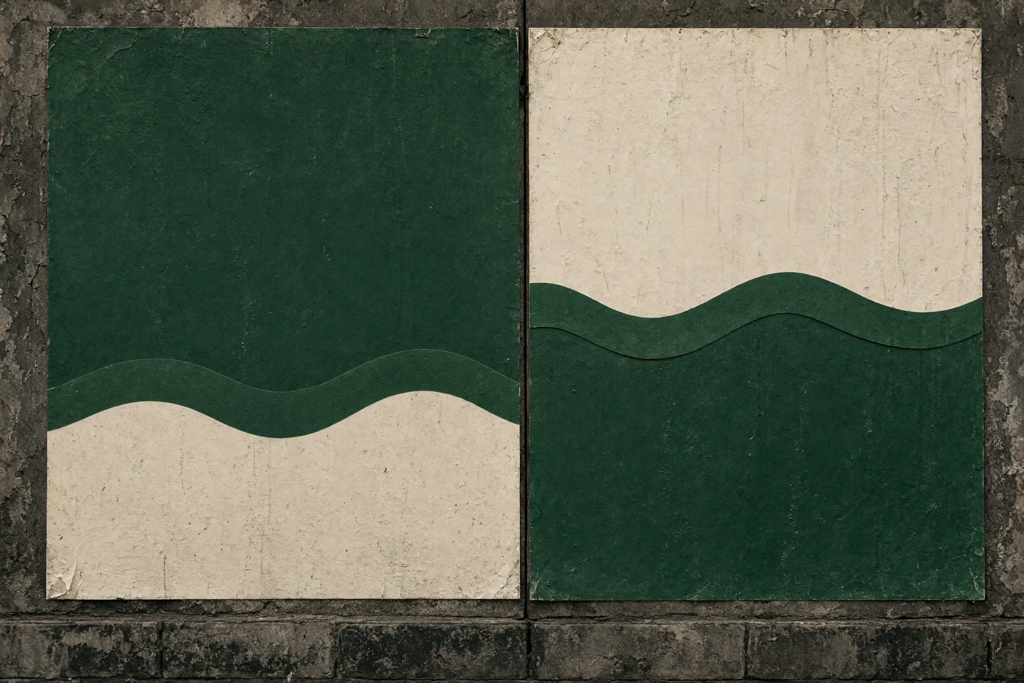
The re-drawn panels cost a fortnight, which came out of our margin rather than Verrand's budget, because the schedule was ours to hold. That is the honest accounting: the mistake was not free, it was just not billed.